Wednesday, October 17, 2007

VizThink: Vizionary!

VizThinkToronto5-4


Here in Toronto we just ran VizThink Toronto 5, a.k.a. "Vizionary!".

So what is Vizionary?
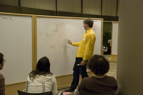
In a nutshell, a modified version of the family favorite "Pictionary". We took the basic premise and tweaked it to be played in a large group environment in a round-robin tournament style.

Overall I think it was a great success, when I posted the event I wasn't sure if I'd get anyone out as it wasn't a traditional "Come learn something from a speaker" kind of event. We ended up having 16 people show up so we played in four teams of four - which, in looking back was a pretty ideal size for a test group.

At the end of the day, running a Vizionary tournament is a pretty straightforward process and there isn't really a wrong way to do it.

What you'll need:
  • Index Cards
    Pick up a few packs of multi-coloured index cards from your local Office Supply Store. Figure on a minimum of about 10 cards per person attending to ensure you'll have enough words for the evening.
  • Sharpies
    For writing on said cards
  • Vertical Writing/Drawing Surfaces
    Whiteboards, easels, pads of paper etc. You'll need a drawing station for roughly every two teams you have playing.
  • Whiteboard Markers
    If you use whiteboard surfaces for the game
  • Timing Devices
    For each drawing station you'll need some way to keep track of time. Plus one master timer for the rounds.
1. Create the Categories
Unlike Pictionary, which comes with a nice box of cards with lots of words on them, in Vizionary we make our own.

The first step is to pick some categories - for this initial version of the game I just brainstormed some categories with a couple of other people ahead of time. Ideally you could work in a session at the start to get the group involved in setting the categories for the evening. At this point though I was more concerned with the actual mechanics of the game etc. that I didn't want to add another level of complexity to the evening.

Click to EnlargeCategories are a tricky thing - if they don't work the rest of the evening will suffer as they drive the context of the evening. Because the participants are creating the words there's a lot of room for some strange stuff to end up on the cards, as a result you need to find categories that have the following characteristics:
  1. Broad enough that there will be plenty of ideas and hopefully minimal repetition.
    For example "Pets" would probably result in a LOT of "cat" & "dog" cards.
  2. Lend themselves to unobvious concepts/pictures.
    Taking the "Pets" example. "Cat" & "Dog" will be pretty much slam dunks. Especially in a room full of people with some artistic skill. But "Animals That Make Bad Pets" would probably end up with some interesting ideas.
  3. Are not so obscure that most people wouldn't know the subject matter
    "Architectural styles of the late 17th Century" - do I really need to expand on why this wouldn't work?
For our version we ended up with the following:
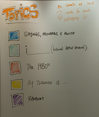
  1. Sayings Proverbs and Advice
  2. i______ (Fictional Apple Products)
  3. The 1980's
  4. My Toronto is...
  5. Random
Overall I think they worked for the most part. #2, i______, was probably the most troublesome. It never quite struck a balance, the words were either ridiculously hard or really simple. And in retrospect we should have limited #1 to 5 or 6 words.

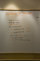
Assign each category a colour of card and you're ready to go. As you can see in the picture above an extra whiteboard/pad & some coloured markers makes for a good legend.

2. Creating the "words"
So this is where we kicked of the participation portion of the evening. As people arrived we asked them to grab at least two cards for each category and come up with ideas (one per card). Within about 15 minutes we had a really healthy stack of cards that would get us through the game. If you do the basic math @ 2 ideas x 5 categories that's ten "draws" per person - Factor on each person drawing once per round you could run a game of ~9-10 rounds, or 18-20 teams playing each other once.

Again, there's another opportunity here to do an activity to get people stimulated and thinking creatively - the challenge though is you don't want the words seen by everyone as it will spoil a large part of the game. For the most part though I found people were pretty good at coming up with some pretty unique and interesting ideas.

Some notes to pass on to your group about the words though:
  • It doesn't have to be just one word but keep in mind that there's only two minutes for someone to draw this concept so try and keep it brief (~5 words max)
  • It should be commonly known. Unless you're with a very niche group of people keep the ideas in the "general knowledge" realm.
  • At the same time avoid the obvious ideas - it's probably a good idea to throw out the first idea that comes to mind for a category as many others will probably think of it to.
  • Have fun with them!
3. The Game
Ordinary Pictionary is a board game, but that really doesn't translate well to large groups of people. The structure that seems to work well is a round-robin, everyone plays everyone else format. For the nitty-gritty on how to schedule this kind of format check out Wikipedia's entry on it. It's quite straight forward.

It takes about 15-20 minutes to play a round if you have four people per team and they each draw once so keep that in mind when scheduling. We played for ~70 minutes and everyone seemed to be having a great time, we probably could have gone another 30 and still kept people engaged. That would work out to a 6 team round-robin game.
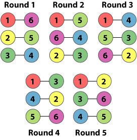
round-robin
6 Team Round Robin

If you're lucky enough to have the problem of a lot of people, just split the teams out into "leagues" and have the teams only play other teams in their league:

Click to Enlarge
8 Team Round Robin w/Leagues

Keep in mind that for every two teams you'll need one drawing surface (Whiteboard/Easel) - If necessary you could also play with having three teams play at a time.

Here's the rules we used:
For the person drawing:
  • No talking.
  • No letters or numbers.
  • Feel free to gesture!
  • Take the card on the top of the pile. If it's a card you made slide it back into the deck randomly
Points & Timing:
VizThinkToronto5-2
  • The Drawing team gets one minute to guess. 5 points for guessing in the first minute.
  • After one minute there's an additional one minute "All Guess" where both teams can guess. 3 points for guessing during this time.
  • A Round is each person from both teams drawing once or 20 minutes, whichever comes first. Teams can keep drawing for fun if they're waiting for a round to end.
  • Whichever team outscores their opponents in a round gets a bonus 5 points.
Most Importantly:
  • Have fun, step outside your comfort zone and go for it!
Our winning team that night was the group that throughout the night let it all hang out and even came up with their own secret code for the drawer to use to help break down the words/concepts.
4. Go Have a Beer
Finish the night off a local pub - there's nothing more fun than a group of VizThinkers with their "creative adrenaline" pumping at the end of the night. Some of the most interesting/fun stuff comes out of the "over-beers" conversations.

If you do run a Vizionary! night let us know how it goes - and defenitely let us know of any modifications or adaptations you make. These things are a work in progress so feel free to innovate and improve on it!

Tuesday, October 16, 2007

Humor is serious.

Why? I think humor aids learning. And who would argue that it's not a great way to relax people, get them talking, loosen up tense situations and get your brain working again when it's been sitting dormant or bored?

Every VTS should have a learning objective -- a clear and real goal -- that can be referred back to if things get off track or bogged down in details.

But first check out this excerpt from Todd Holm's web site at Minnesota's Concordia College:
Education teaches convergent thinking. We teach students to look for the answer. Thinking converges on an answer, through a formula. There are measurable, right-or-wrong responses.

Humor promotes divergent thinking. We are encouraged to look for the possibilities not the answer.

"Children start off life putting ideas together in all kinds of ways, creatively and freely. Not coincidentally, they also laugh frequently, 5-year-olds over 400 times a day. But as [they] grow up, [their] thinking gets more constrained, in part because it becomes more goal oriented and more bound by conventions (Morreall, 1991, p. 368)."

So what we don't want is for the session to be all work and no fun. It's OK to have a good time, too. And while there's no elegant, surefire way to inject humor into every VTS you can easily change the pace and pick things up with a quick round of "misinterpretations."

This is purposeful divergent thinking -- (almost) purely for fun. Here's how to try it:

  1. Pass out slips of paper with different phrases on them or have individuals (or groups if you have a lot of people there) reach into a bucket to get one. These phrases should be prepared before the session and can be related to a specific topic related to this VTS -- or not. It's good to have some sort of a unifying theme, though, such as "common travel phrases" or "things said at technology conferences."

  2. Have everyone visualize their phrase on a whiteboard or giant Post-It. Ten minutes should be enough. Try to do all the drawing in one room with the images up on the wall.

  3. Now everyone walks around and makes at least one attempt to correctly interpret one of the drawings, in writing on the whiteboards or sticking up smaller Post-Its.

  4. Once they've made an honest effort, everyone goes around to all the drawings and purposefully misinterpret them. Write what you think each drawing *could* be representing even if that interpretation is funny, unrealistic or downright ridiculous. Give this part another 10 minutes or so.

  5. After everyone has contributed, go around the room and read off all the misinterpretations then tell the group the drawing was supposed to represent. Done.


Chances are you heard lots of chuckles and a few big laughs as people went around writing down their smart-aleck comments.

But the serious takeaway is how easy it is to misinterpret a drawing meant to have one specific meaning. Often visual communication work has enough context to help icons or illustrated scenes make sense, but this exercise reminds everyone that it is frighteningly easy to be too vague or too specific when visualizing something -- the right balance is difficult to achieve when you are trying to keep visuals simple but informative.

With a quick 20-minute exercise like this, you've gotten everyone up out of their chairs, moving around, talking and laughing. Getting back to business should be easy after this refreshing exercise/break.

Communicating effectively is serious business, but remember to have fun out there!

Wednesday, September 26, 2007

Visual Thinking School: Finding other visual thinkers

DSC08396

As Dave outlined previously, running a Visual Thinking School (VTS) style event isn't all that difficult, some supplies (pen & paper), a space and idea will go a long ways. That said, I'm sure some of you are thinking "Sounds great, but a party of one isn't going to be very fun".

Believe it or not, finding other visual thinkers isn't that hard - here in Toronto I've run four VTS events, dubbed "VizThink", with the fifth in the works for October 11th. Our first "VizThink" event was about 18 people and since then it's grown continually. Registration is up for VizThink5 and we're looking like we're going to hit our venue capacity again (we've basically had full houses since VizThink2), and this is for a Pictionary Tournament!

The reality is these events have grown through word of mouth using a few free tools online. In this post I'll outline some of the tools I've made use of to help promote the events and hopefully help you connect with the visual thinkers amongst us.

1. Uncover the ones you already know.
You probably know more visual thinkers than you think - it's important to remember that the VTS concept isn't just for artists, anyone can contribute and find value in these sessions and there's a lot of people out there who'd take a picture over the thousand words.

The easiest first step to take is to let the people you know what you're trying to put together. For VizThink1 I literally let my friends know (through email & other conversations) what I was planning to do and immediately had 10 or so folks respond and express interest. This was enough to give me that extra nudge to take the idea further and set up an event.

2. Facebook
There's an active VizThink community forming on Facebook - you will find it here. There's almost 200 members at this point from all over the world. This is a great place to see if anyone near you is participating and interested in helping you get an event off the ground.

If you do plan an event be sure to post it on that group as well. You can create the event in Facebook yourself or I'd be happy to add it as an event for that group.

3. Upcoming.org
If you haven't used upcoming.org before it's basically a site for posting event listings. It seems far more popular in North America then other regions of the world but there are events listed all over the place. Many people found the Toronto VizThink events through this site so I'd highly suggest that once you have a date & time post your details here as well (if you don't have a venue yet just enter TBD - usually someone will have already created a fake venue called "TBD" in your city).

4. Blog it!
Got a blog? Post it there. Also - let us know and we'll be sure to make mention of it here on the Visual Thinking School blog as well. Ask your registrants to blog about it as well - word of mouth is the best way to get people out.

Registration
The real key is to setup a central registration point - Facebook & Upcoming both allow people to indicate whether they will attend or not but in order to do that they will have to register with the site , which may turn some people off.

We're working on getting a dedicated VTS/VizThink Wiki setup but in the interim all of the previous VizThink event pages can be found here. Feel free to add your event here and use one of the previous event pages as a template. The format for naming your event page is VizThinkCity# - where City, is where your event is taking place and # would be 1 in this case. When we do get the wiki up I'll move everything across.

Also, if you need any help or just have questions feel free to drop me a line ryan.coleman (at) gmail.com or get involved in the mailing list - sign up using the form in the sidebar, or go here.

Tuesday, September 25, 2007

Visual Thinking School (VTS): Getting started

How to start your own Visual Thinking School:

Ingredients (What you need):
1. A time and place to have it
2. A group of people who are interested in visual thinking (keep a list of email addresses)

Recipe: Once a week (or once a month):
1. Before each session, send out email invitations (include a map)
2. During each session,
- Agree on a learning objective and facilitator for the next session
- Get names and email addresses of anyone new to add to the list
- Designate someone to place the recipe and key learnings on the wiki
3. After each session, be sure to put photos, recipe and key learnings on the wiki

Community resources:
Visual Thinking School blog
Photo group
Email discussion/membership list (new)

Email dgray at xplane dot com if you want to start your own Visual Thinking School, or if you want to be an author on this blog, or you want to be on the invite list.

Sunday, September 23, 2007

Color course

This course is an interactive exploration of color and design. It covers some basic color theory and then in to designing color palettes and discussing the pros and cons of various strategies and approaches.

Learning objective
WHO: Anyone
DO: Improve the quality of your color choices and your application of color in any design project
Questions:
- What are the basics of color theory?
- What are some different approaches to designing with color?
- When is color-coding a good idea and when is it inappropriate?
- How does color relate to emotion?
- What colors and color-signals are truly international?

Ingredients
- Paint chips from your local hardware or paint store
- Drafting dots
- Lots of whiteboard room or wall space with plenty of sticky-backed flip charts
- Appropriate markers for the whiteboard or flip charts
- Card deck made of index cards, with each card having an emotion or emotionally evocative phrase written on it, for example, Stormy, Freshness, Angry, Smug, Moving, Happy, Facetious, Flippant, Jolly.

Recipe
Notes/tips from from previous sessions:
- Watch out for laptop cords etc. You might want to clear away any such things before the session starts. This is an interactive session with a lot of moving around and things can break!
- This may need to be split into two or more sessions. Size of the group is a big factor to consider. With a group of 14 we were only able to get through two of the exercises.
- Section 2, color theory overview, should probably be done as a handout.

1. Start with an icebreaker of your choice
A good icebreaker for this session would be something that gets people to reveal their mood or emotion. A strenth of color is to set tone and mood, and discussion of emotion will help set the tone.

2. Basic color theory overview
Color is light, and exists along a spectrum which ranges from infrared to ultraviolet. The range that is visible to the naked eye is approximately what you see when you look at a rainbow, usually described as violet, indigo, blue, green, yellow, orange, red. A couple of mnemonics to help remember this are VIBGYOR or ROYGBIV (I prefer VIBGYOR). In design, we usually use a color wheel because it can help us describe the various kinds of possible relationships and combinations.

Use the color wheel to describe and discuss the following:
- Primary, secondary and tertiary colors
- Complementary colors, analogous colors

The color wheel, however, only describes one of color's dimensions. Color actually has three dimensions: hue, value and chroma.

Hue is what we generally think of as the color, as shown below. Red, blue, green and pink are all hues. You could think of hue as the name of the color and, yes, its "color." The range of hues is what we see when you look at a color wheel.

Value is the lightness or darkness of the color. Light blue has a lighter value than dark blue. Yellow has a lighter value than red. Surprisingly, the value of red and black is almost identical. It can be easier to see relative values if you look at a black-and-white photo. Sometimes people look through a red filter to help them see and differentiate values more accurately.

As a color moves toward the high end of the value scale (towards white) it is known as a tint. As it moves toward the low end of the value scale (towards black) it is known as a shade. A color palette that tends towards tints is sometimes called a pastel palette, while a palette that tends towards shades might be thought of as richer, like mahogany, burgundy or British Racing Green.

The value scale ranges from light to dark.

Chroma, also known as intensity, is the brightness of a color. This is different than value. Every color has a certain point at which its choma is brightest. For example, yellow is brightest at a very high value, while indigo is brightest at a very low value. The chroma scale ranges from bright to dull or gray.

Exercise: Hue, value, chroma and accents
a. Choose a hue from the color wheel and name it by name.
b. Using the paint ships provided, find the brightest example of that color you can find, as well as the lightest tint and darkest shade within the same hue. Put the tint on top, the color in the middle, and the shade below.
c. Now find the analogous colors that would be to the left and right of the color you selected on the color wheel. Put them to the left and right of your color. Now you should be looking at a plus sign or cross.
d. Now pick four more "accent" colors that you feel round out your color palette in an aesthetically pleasing way, and place them at the four corners, so you have a 3x3 color matrix.
e. Tape your 3x3 matrix up on the wall.
f. Now go around the room and have each person describe their color palette, using the following discussion questions:
- Why did you choose the four colors that you did?
- How did the colors you chose map to your main hue? Were they complementary, analogous, tertiary? Something else?
- If you were to give your color palette a name, what would it be?
- What emotion does this palette evoke?
- In what kinds of projects might you use this color combination?
g. Now have people try to change the feeling or emotion of their palette dramatically, by switching only two of the accent colors.
- What difference did the accent colors make?
- How were you able to change the emotion or feeling change by changing the accent colors?
- What would you name your new palette?

4. Intuition and color
Color has a strong power to evoke emotion. In Euro-American culture, Blue tends to give a feeling of security while red gives the impression of power. This may be why the "power suit" combination of a navy blue suit and red tie is so effective. From an evolutionary perspective we are geared to notice anything that is different or stands out. Since earth tones, blues and greens are found in almost any natural environment, they tend to be soothing and have a calming effect. Bright colors such as bright red or yellow are unusual, and thus tend to grab our attention.

Exercise: Intuitive palette
a. Pick a card from the emotion deck
b. Now, using the same 3x3 matrix, try to create a palette that evokes the feeling on the card you drew, using six colors that are analogous and three colors as accents. Arrange them however you like.
- Note: Ask them to change the colors in their palette, not the palette. One guy got the word "old" and started ripping up his paint chips instead of trying to select colors!
- NOTE: While people are working on their palettes, collect the cards and make a list on a flip chart or whiteboard. Then go around the room and see if people can guess which word is represented by each palette.
c. Go around the room and discuss. Discussion points:
- Have people guess the name of the palette
- How did you go about choosing your palette? Why did you choose the colors you did?
- Was it easy or hard for you? Why?
- What kinds of projects would this palette be good for? Why?

5. Culture, symbolism and color
People make a big deal out of this and show great concern over it, but in my experience (says Dave) the people who are most concerned have little experience with other cultures. I say, be thoughtful, but don't worry too much about this. Coke cans are red all over the world and, for better or worse, most people I have spoken with tend to accept, or at least understand, western interpretations of the meaning of color. And traffic lights are red, yellow and green all over the world, and have the same meaning everywhere. However here is a list that may be useful for consideration but is in no way comprehensive or authoritative:

Red
China: Good luck, celebration, summoning
Cherokees: Success, triumph
India: Purity
South Africa: Color of mourning
Russia: Bolsheviks and Communism
Eastern: Worn by brides
Western: Excitement, danger, love, passion, stop, Christmas (with green)

Orange
Ireland: eligious (Protestants)
Western: Halloween (with black), creativity, autumn

Yellow
China: Nourishing
Egypt: Color of mourning
Japan: Courage
India: Merchants
Western: Hope, hazards, coward

Green
China: Green hats indicate a man's wife is cheating on him, exorcism
India: Islam
Ireland: Symbol of the entire country
Western: Spring, new birth, go, Saint Patrick's Day, Christmas (with red), envy

Blue
Cherokees: Defeat, trouble
Iran: Color of heaven and spirituality
Western: Depression, sadness, conservative, corporate, "something blue" bridal tradition

Purple
Thailand: Color of mourning (widows)
Western: Royalty

White
Japan: White carnation symbolizes death
Eastern: Funerals
Western: Brides, angels, good guys, hospitals, doctors, peace (white dove)

Black
China: Color for young boys
Western: Funerals, death, Halloween (with orange), bad guys, rebellion

Discussion points:
- Can you think of a time you interpreted a color differently than someone else? What happened?
- Discuss the pros and cons of color-coding? What are the opportunities? What are the perils?
- Ask anyone who has experienced cultures other than their own talk about things they have noticed about the color sensibilities of other cultures

6. Experimental approach
One of the best ways to discover new color combinations is simply to experiment.

Exercise: Color soduku

a. Pick nine colors and arrange them in a matrix such that the three colors in any row or column are similar in some way. Use any definition of similarity that you might like, conceptual as well as physical.
b. Look at your palette and try to give it a name that represents its feeling/mood

Discussion points:
- Describe your color choices and how you set the rules for yourself
- What name did you give your color? Why?

7. Limited palette:
When you're uncomfortable with color, sometimes the best approach is to limit your options. This is called a limited palette. Forcing yourself to work within tight constraints can help you understand what small amounts of color are truly capable of. You can start working with a limited palette and gradually add more colors as you go.

Exercise: Limited palette

a. Choose another emotion card from the deck
b. Pick three and only three colors that will evoke that emotion
c. Go around the room and have people guess what emotion the colors represent.Pay special attention to the differences.

Discussion point:
- What insights did you have as people tried to guess the meaning of the colors?

Exercise: Color palette design
a. Have everyone in the room create a 3x3 color palette for the piece
b. Have each person discuss their thinking/approach.

8. Reflection and close

Discussion points:
- What have you learned that you can apply tomorrow? What do you intend to do differently?
- Who are the recognized color experts within the group? Where could you go to find help/advice?
- How can we improve this color course?
- What else do you want to learn and explore?